Interactive AI Paper Explainers with intuitivepapers.ai
Can we use AI to explain machine learning papers properly, with the prerequisites, math, and interactive figures?
When I read a machine learning paper, I often spend a lot of time looking up the ideas it builds on. A paper describes a new contribution, but understanding that contribution may require working through several other papers first.
I sometimes ask an LLM to explain a paper to me. This is useful for getting started, but I have found that the explanations can sound convincing while getting important details wrong. A sign in an equation, whether a result is exact or approximate, or which variable is being updated can change the meaning quite a bit. And if I don’t already understand the paper, these errors are difficult to notice.
I wanted explanations that build up the intuition and math together, with figures I could interact with. I’ve explored this on a smaller scale in my gradient descent demo: changing a parameter and watching what happens can make an algorithm much easier to understand.
Starting With One Paper
I first worked on an explainer of the DiffusionBlocks paper with Claude. This took about a week of iteration. Getting the math right meant going back to the original sources, and in the process I found what appeared to be a sign error in the paper’s equations.
This made me wonder how much of the process I could automate. Could I put together a system that reads a paper and its references, works through the math, creates interactive figures, and checks the resulting explanation?
The result is intuitivepapers.ai. At the time of the original post, I had used it to produce twenty explainers, covering papers such as Attention, BERT, GANs, VAEs, CLIP, PPO, Mamba, and Adam.

The intuitivepapers.ai homepage.
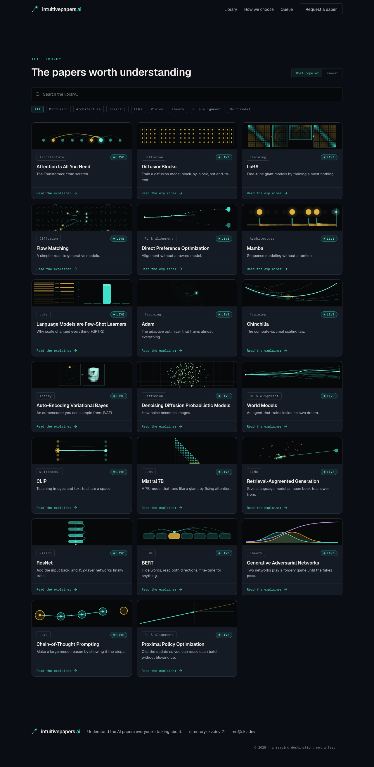
The paper library. Each card previews a figure from the corresponding explainer.
Interactive Explanations
Each explainer starts with the prerequisites and works towards the paper’s main idea. A navigation panel, called the concept tower, lists these concepts in the order they depend on each other. Where it helps, the explanation also includes code to connect the math to an implementation.
The figures are interactive. For example, PPO uses a clipped objective to limit the incentive for certain changes to a policy. In the figure below, you can change the probability ratio and the sign of the advantage, and see where the objective becomes flat. This makes it easier to see when clipping takes effect than by looking at the equation alone.
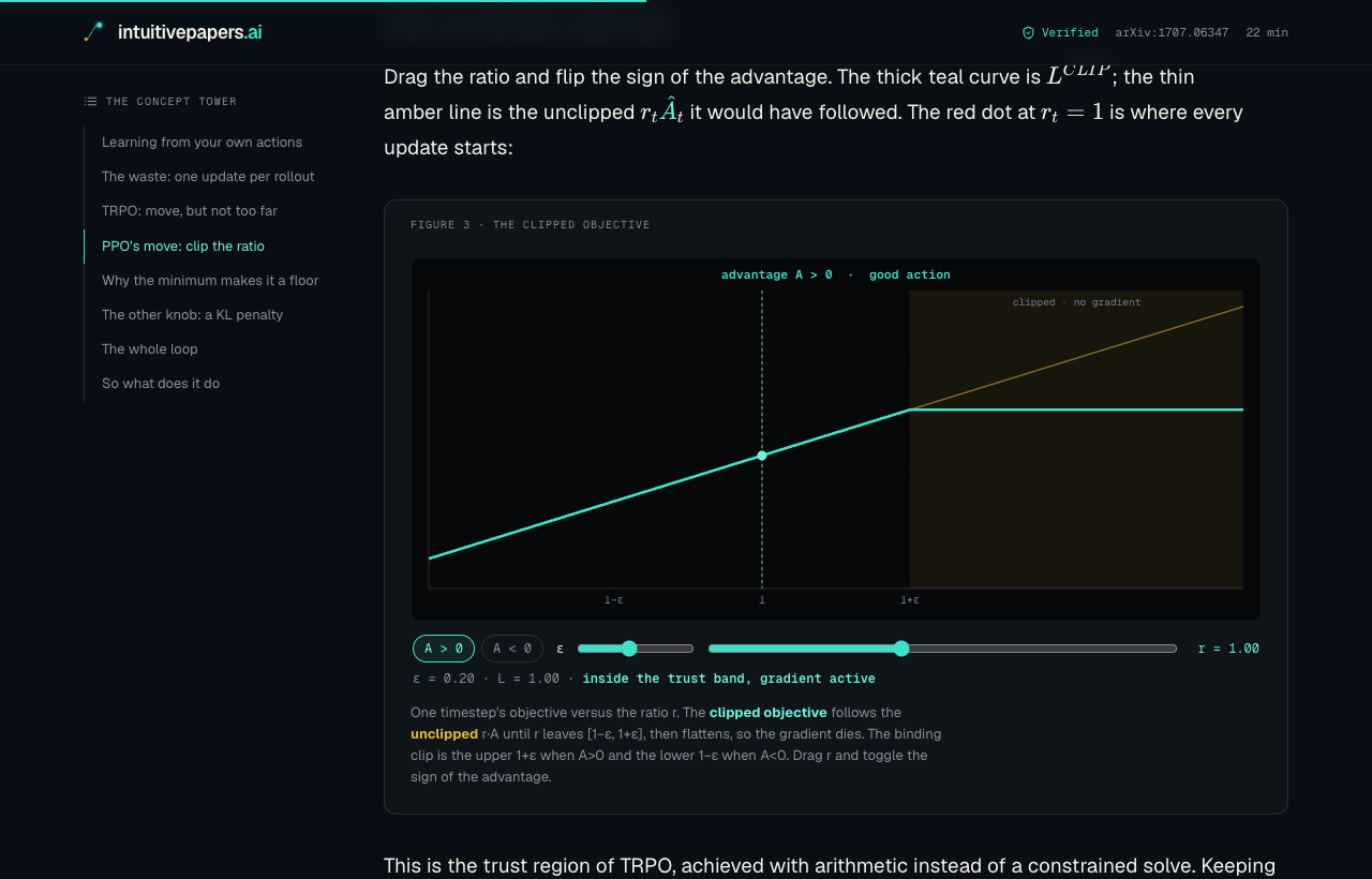
Exploring PPO's clipped objective by changing the probability ratio and the sign of the advantage.
The figures also work on a phone:
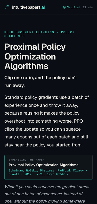
The PPO explainer on a phone.
Another example is CLIP, which learns to associate images with text. The grid below shows the scores for pairs of images and captions. The diagonal contains the matching pairs; the other cells are mismatches. We can use this to see what the training objective is trying to achieve.
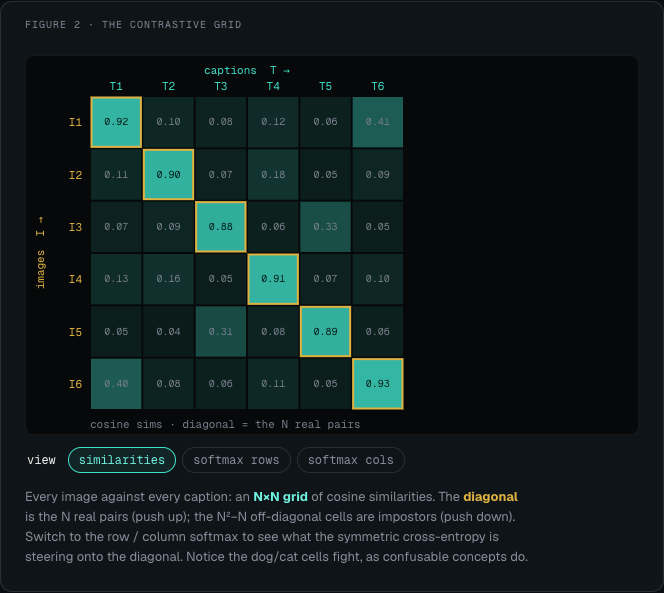
CLIP's image and caption scores. The matching pairs lie along the diagonal.
Generating an Explainer
Asking an LLM to explain a paper in one pass wasn’t sufficient for what I wanted. I split the work into stages: reading the sources, checking the claims and equations, designing the figures, writing the explanation, and reviewing the draft.
The checks use the paper itself, the primary literature it refers to, and the authors’ code. Separate critic passes then look for problems in the draft before it is published. The idea is to make verification an explicit part of the process, rather than assume that a plausible explanation is correct.
The pipeline runs on a timer on the Mac mini under my desk. It takes the next paper from a queue and works through these steps, including deploying the finished page, mostly without my involvement. Feedback submitted by readers is used to correct the page and update the instructions for future explainers.
Below is another example of the output, showing the pieces of a Mamba block. The library had over a hundred custom figures when I put this post together, drawn using canvas rather than a charting library.
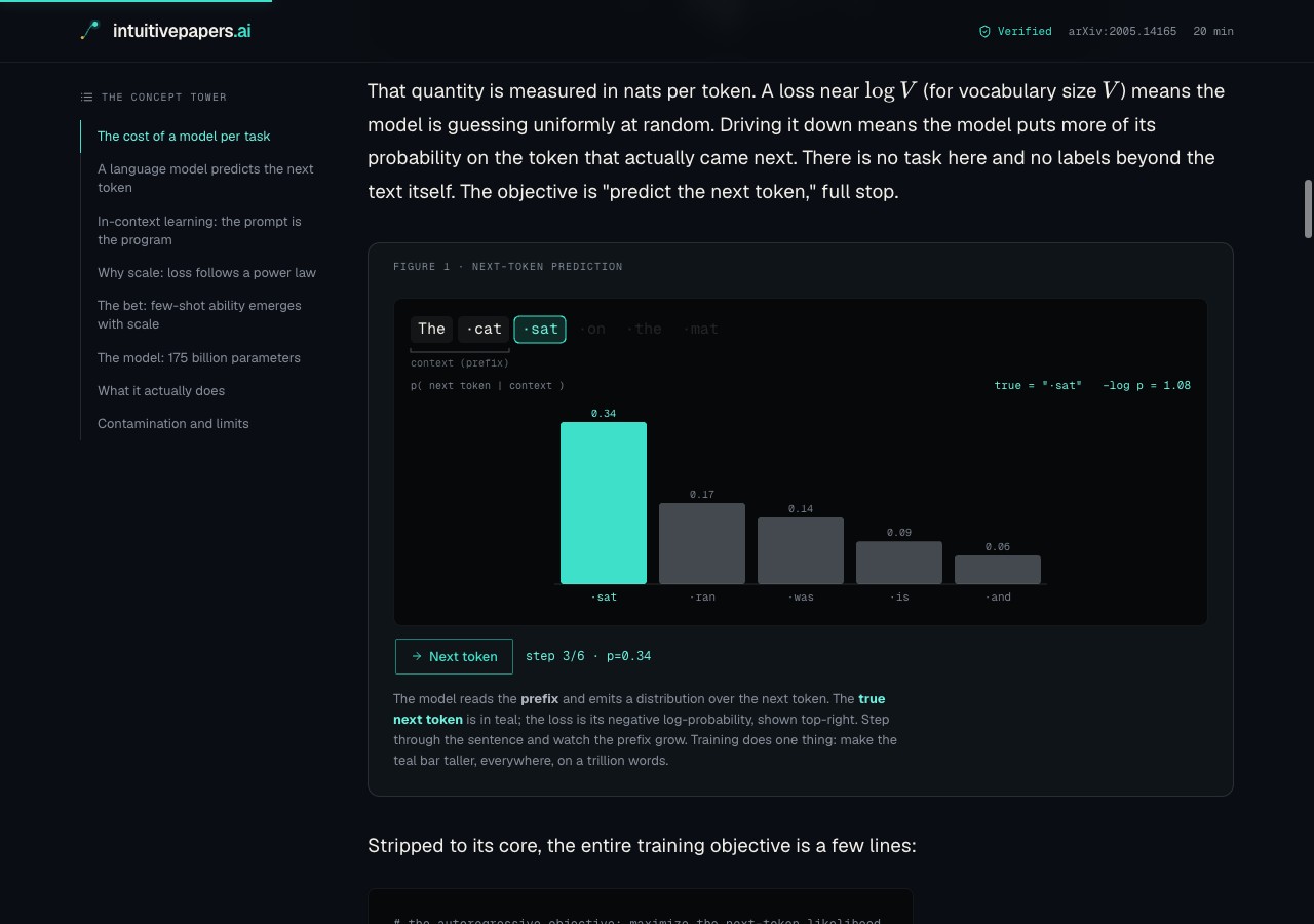
A breakdown of a Mamba block, from the Mamba explainer.
Final Notes
This started with a paper I wanted to understand, and became an experiment in automating the work of explaining one. Checking the sources is useful, but it doesn’t make an automatically generated explanation infallible. The feedback and correction process is part of the project too.
If there’s a paper you’ve been meaning to work through, take a look at intuitivepapers.ai. You can request a paper or upvote one that’s already in the queue. And if you notice an error in an explanation, please send feedback through the page so it can be corrected.
